Async Management
Crono uses different methods to manage the loading of pages or single components and make navigation more fluid for users.
import { Loading, PageLoading, Spinner, Skeleton } from "@matchplat/crono";
Components Loading
The components are managed individually or in groups. It is possible to manage them individually using a Spinner or a Skeleton.
Pages Loading
Loading and PageLoading are mainly used to load pages while routing the app.
import { Loading, PageLoading } from "@matchplat/crono";
Spinner
The Spinner is a classic loading component, customized like any other component in Crono.
import { Spinner } from "@matchplat/crono";

<Spinner secondary height="4rem" width="4rem" />;

This is automatically inserted into components such as the Button with properties that manage its loading to prevent button spamming.
import { Button } from "@matchplat/crono";

<Button isLoading />;
Skeleton
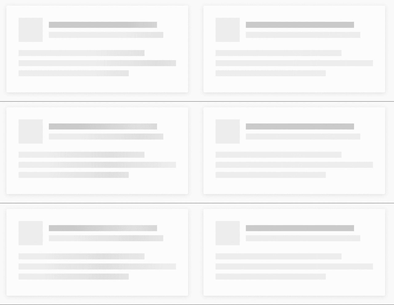
The Skeleton is a placeholder that replaces the component by imitating its shape and is managed with a loading animation.
import { Skeleton } from "@matchplat/crono";

<Skeleton
  height="article"
  width="200px"
  repetition={2}
  direction="h"
  margin="v"
/>;

Skeleton Defaults
Some components have a loading prop which automatically generates a skeleton during loads if passed as true.
It is possible to pass through these components all the properties of the Skeleton itself. Some of components* have default skeleton settings, the Typography, for example, has height equal to the size of the text and a vertical margin that acts as a separator between the various lines of text.
You can override the default props by passing your custom properties.
import { Typography } from "@matchplat/crono";

<Typography
  loading={loadingState}
  size="title"
  skeleton={{ height:"subTitle" width: "4rem", direction: "v" }}
>
  This is a text with a Skeleton loader
</Typography>
Components with default Skeleton:
- Typography
- Card
- IconButton
- Icon
- Avatar
- MenuItem
- Select/MultiSelect
- Input
- TextArea
- DropDown
- Checkbox
- Chips
- Chip
- Button (
loadingprop whileisLoadinguse a<Spinner />) - ProgressStep
- Switch
Skeleton Area
It is possible to insert the components inside a context with a loading state.
It is very convenient if the components used have a default skeleton because it is no longer necessary to pass the loading prop to each individual component.
import { CronoSkeleton, Box, Typography } from "@matchplat/crono";

<CronoSkeleton loading={state} repetition={2}>
  <Box column>
    <Typography size="article">This will</Typography>
    <Typography size="title">be on loading</Typography>
    <Typography size="article" width="200px">
      when loading is true
    </Typography>
  </Box>
</CronoSkeleton>;
CronoSkeleton has all the props of the Skeleton and it is therefore possible to customize the component to your liking. Remember to use the default values of the theme as much as possible.
You can use useCronoSkeleton to use the context inside custom components.